CES Picks

App Redesign & Marketing Campaign

City Electric Supply is an electrical wholesale distributor with over 500 locations across the US. CES Picks was created in 2016 as a way to encourage brand engagement between branch employees and their customers. Individual branches were already participating in fantasy football which gave CES the idea to create an app that would reach more people.

CES Picks follows the NFL season schedule and has users select which team they think will win an hour before kickoff. At the end of each week, users can see how they rank against other Picks players and against friends in their leagues. With added features like live game updates, real time results, and upcoming games information our goal was to have Picks be the primary app for users to keep up with their games and teams.

As the sole UI/UX designer, I was involved in this project from beginning to end. I met with stakeholders, redesigned and prototyped the app for user feedback, and was in constant conversation with the engineers during development.

How do we keep users engaged with our app?In 2018, our data showed that Picks players were only opening our app once a week in order to make their Picks. We sent a survey to our players and asked what features they’d like to see. For 2020, the surve…

How do we keep users engaged with our app?

In 2018, our data showed that Picks players were only opening our app once a week in order to make their Picks. We sent a survey to our players and asked what features they’d like to see. For 2020, the survey results included seeing how other Picks players did, predeteremined leagues, team news, player updates, game stats, and weather forecast.

We made it our mission to make Picks more enjoyable by giving our users what they wanted, bragging rights. Here you will see the content that populated our home screen in 2018. The problem with this information is that it’s not enticing to the user. They’re only able to see their own progress in the game and what’s the point of a game if there’s no competition?

The SolutionFor the redesign, we made everyone’s Picks and points visible. This way players can see how close they were to beating out their friends or those who are in the top 3 of the leaderboard. One tap on a player’s cell would show all their Pi…

The Solution

For the redesign, we made everyone’s Picks and points visible. This way players can see how close they were to beating out their friends or those who are in the top 3 of the leaderboard. One tap on a player’s cell would show all their Picks and the tiebreaker (guessing the total points scored in the final two games of the week) they made from the previous week.

On top of bragging rights, we wanted Picks to be the app where players could keep up with games even if they weren’t actively watching it. Users could open our app to get play by play updates, along with the score, quarter, which team is in possession, and even down to where the football is on the field. Upcoming games shows the date, time, network, stadium information, and weather in the area. What more could you possibly ask for?

Home-Mockup.png
App map with new features highlighted

App map with new features highlighted


Make Your Picks

The Picks screen is where users go to select their winning teams for the upcoming week. The cells in the app from 2018 were too small for the users to interact with and the text was difficult to read. I decided to increase the height of each cell to make it easier for users to tap and align the text to increase legibility. There’s added functionality on this screen that was not apparent to users so I added an instructions cell to let them know that they can tap and hold each cell to see W&L’s of each team before making their Picks.

 
2018 version

2018 version

2020 version

2020 version


LeaderboardThe leaderboard toggles between weekly scores & all season scores to show players how close they are to the cash prize.

Leaderboard

The leaderboard toggles between weekly scores & all season scores to show players how close they are to the cash prize.

Create and join leaguesOnce the week of games concluded, players can see the number of people who chose the winning teams along with their final results.

Create and join leagues

Once the week of games concluded, players can see the number of people who chose the winning teams along with their final results.

Team HubUsers can review their team’s news and player updates before making their Picks for the week.

Team Hub

Users can review their team’s news and player updates before making their Picks for the week.

 
Team StatsSelecting a team will reveal their standing and stats for the season.

Team Stats

Selecting a team will reveal their standing and stats for the season.

Landing Page

The landing page encourages our employees and branch customers to download CES Picks. We also highlighted all the new features for this year.

picks-LP.png

Email Designs

1-new-players.png
 
3-cash-qualifier.png
 
2-campaign-launch.png

Digital Signage

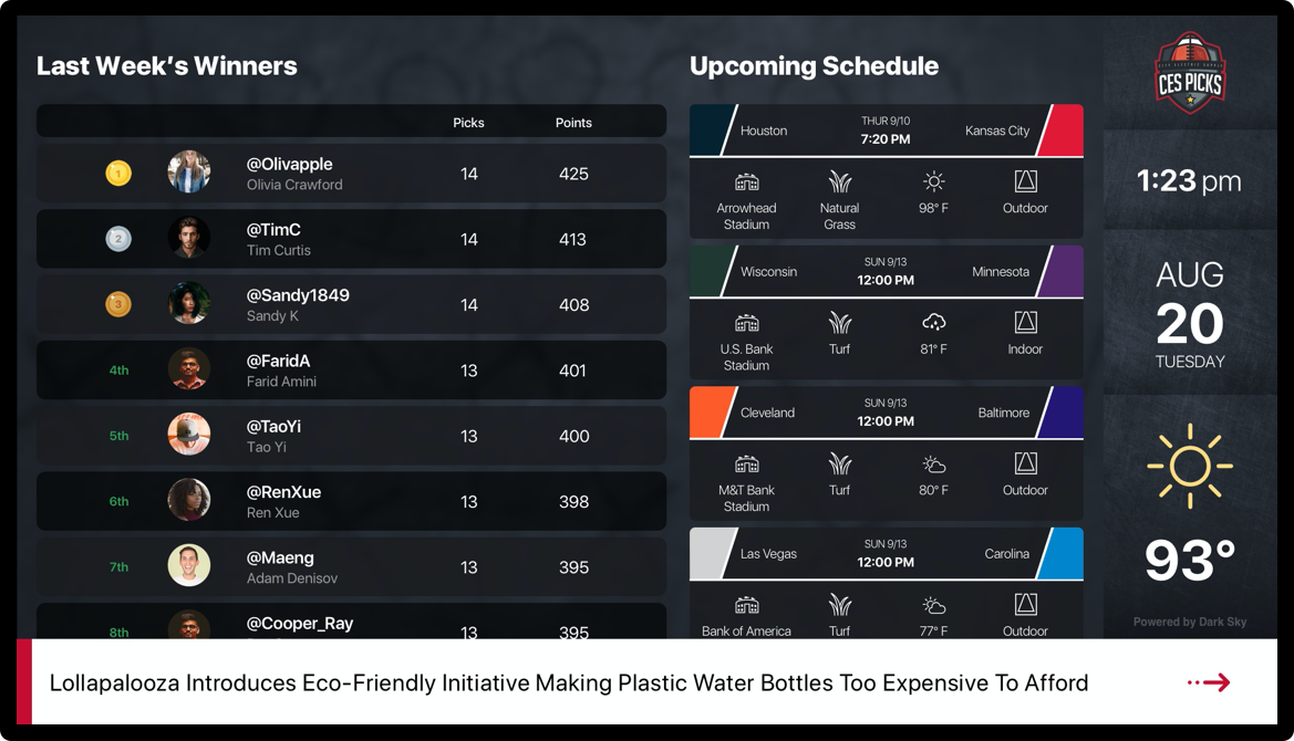
Each City Electric Supply Branch has digital signage for the marketing team to promote featured products and promotions. During football season, the dashboard is taken over by Picks branding to showcase the leaderboard and information about upcoming games. The purpose of this is to encourage our employees and our customers to download the app and play to win.

digital-signage.png

App Ads

City Electric Supply vendors were able to purchase half and full sized ad space in the Picks App to promote their products. I was given assets and content in order to create the ads below. We used this opportunity to place internal promotions and also to encourage players to download other City Electric Supply apps.


locate-branch.png
sept-fp.png
legrand-large.png
oct-fp.png
 
internal-app-ad.png
 
legrand-small.png

Widgets

Widgets created to give users a summary of how their selected team is playing in real time and info about their upcoming game.

widget-mockup.png
 
widget-1.png
 
 
widget-2.png
 
light-banner.jpg